Recognizing the need to connect more effectively with their audience, Social Native embarked on a brand and website refresh, with a particular focus on crafting a new online experience that resonated deeply with their target audience.
1. THE PROBLEM:
Social Native's initial website was committing the same mistake many other companies do. They designed the website to showcase the brand and not speak to their audience. Though at face value this seemed good, it did not effectively speak to their audience nor explain what problems their products solved. It was not designed to convert users into potential clients.
A difficulty for Social Native was that it has two very different customers both needing different messaging. The first are clients, such as big brands like Nike that utilize Social Native's user-generated content (UGC) software on their sites. The second are content creators who sign up to be Social Native creators. This complexity meant the website needed to speak to two very different users: a brand, looking to utilize Social Native's UGC solutions, and a digital influencer accessing the website to learn more and sign up to become a Social Native creator.
2. The Solution
In meeting tight deadlines, we leveraged the extensive knowledge and experience of our existing employees to expedite UX research and gain insights into the various obstacles already in place.
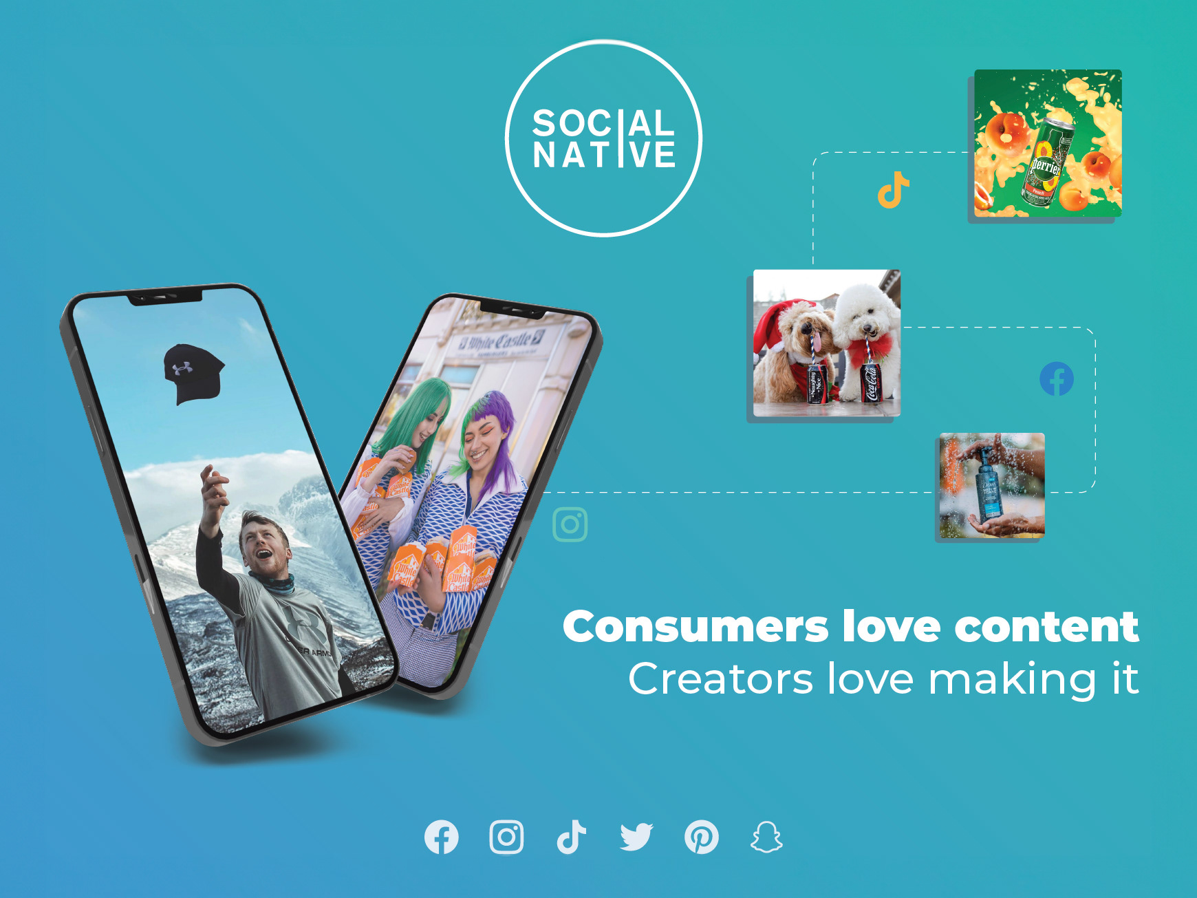
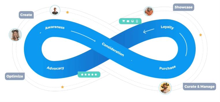
One of the initial enhancements to the homepage included a visually captivating graphic we crafted, highlighting the symbiotic relationship between the brands and creators. This graphic underscored how their partnership yields mutually beneficial returns. It's simple yet vividly illustrates the boundless growth potential in this collaboration, with Social Native serving as the pivotal connector.
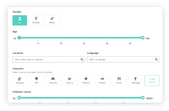
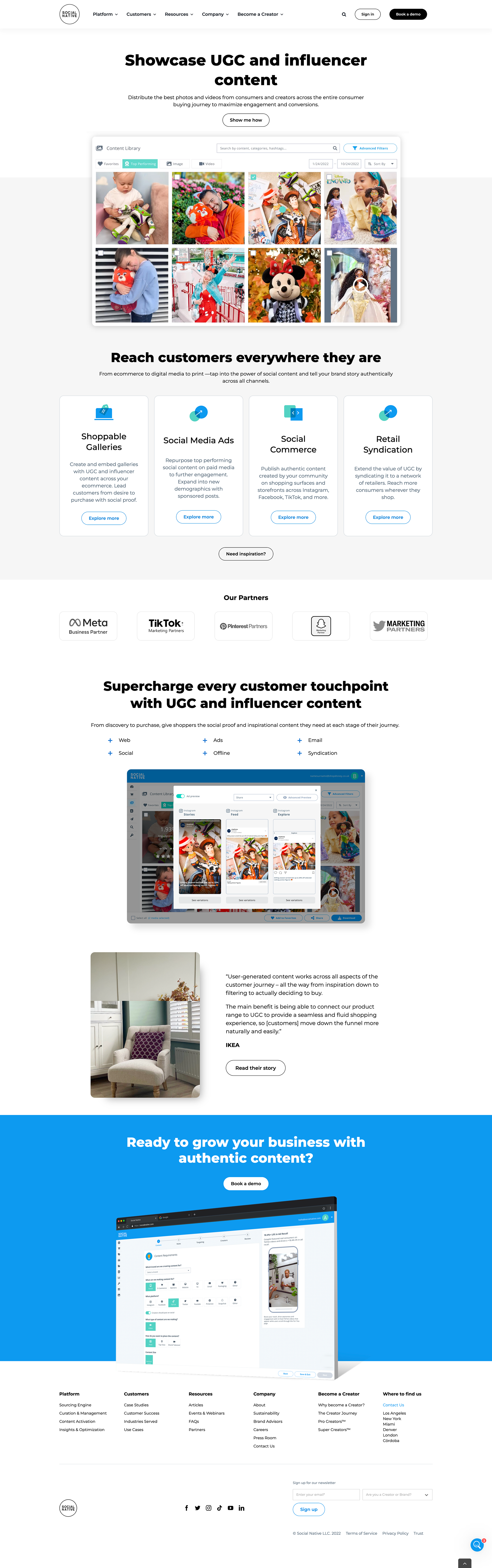
It was crucial to highlight Social Native's UGC platform, but we were aware that its complexity might be overwhelming for viewers. To address this, we recreated the backend of the software into a simplified, streamlined graphic that was easier to comprehend. This approach enabled us to demonstrate the platform's functionality to the users without overwhelming them.
3. The Results:
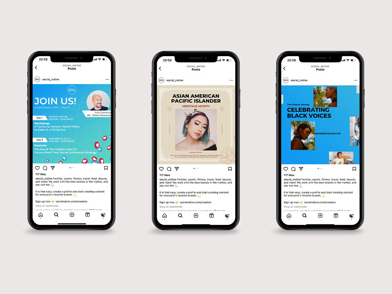
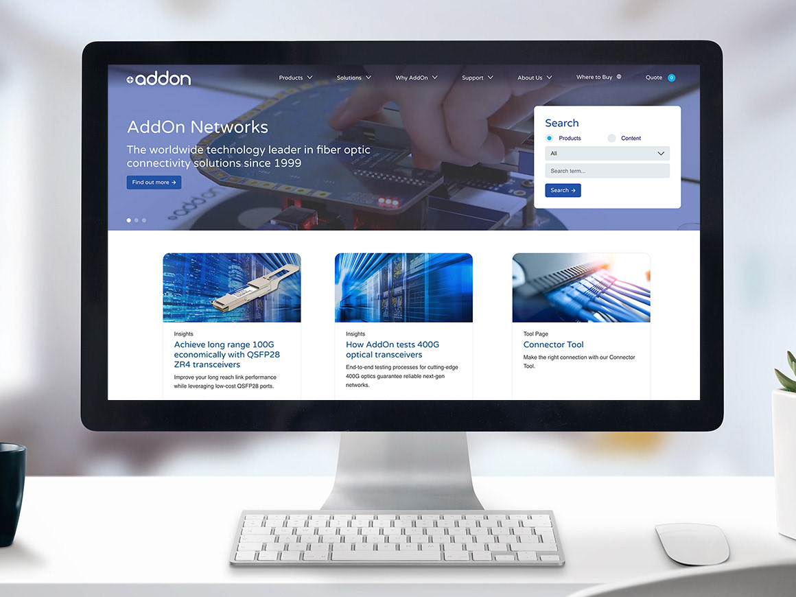
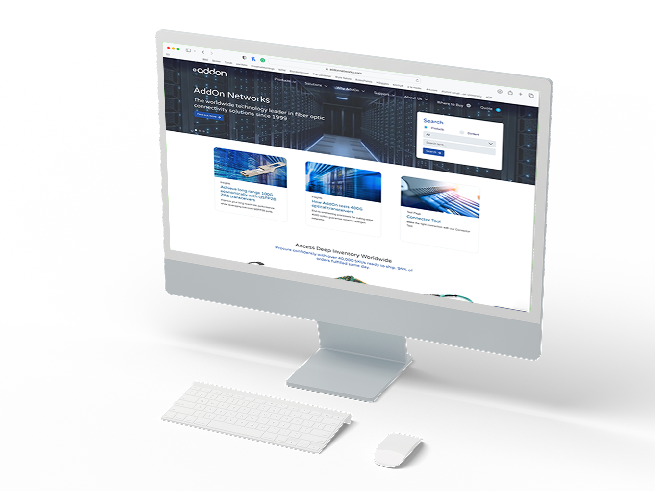
We prioritized a complete redesign of the homepage, recognizing its significance as the initial touchpoint for users. Alongside introducing new graphics to guide users to the company's various solutions, we completely overhauled the navigation menu. The new menu featured visual drop-downs to better organize product lines and dedicated sections for creators to conveniently access their resources. Our primary focus was on enhancing the site's UX to effectively engage both target audiences. Additionally, we refreshed the existing branding to give it a more polished appearance.
New design systems were created to maintain brand consistency across the site and streamline the creation of future content.
As a result of these efforts, website traffic surged by 96% within the first year.
WANT TO SEE MORE?
Check out the social media graphics made for Social Native, or some of their print designs.