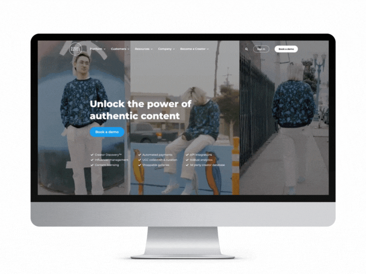
ProLabs needed help to distinguish itself from its competitors. We rebranded the company and redesigned its website to reflect this new branding and enhance the user experience.
1. The problem:
ProLabs struggled to distinguish itself from its competitors. The original branding did not resemble that of a tech company nor elevate it to the global leader that it is. Additionally, the website did not have all the functionality its users needed, it wasn't easy to navigate, and it lacked innovative design that accurately reflected the brand or its industry.
2. The solution:
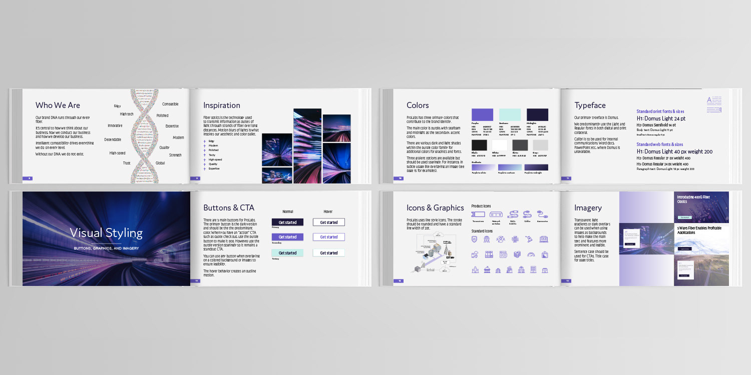
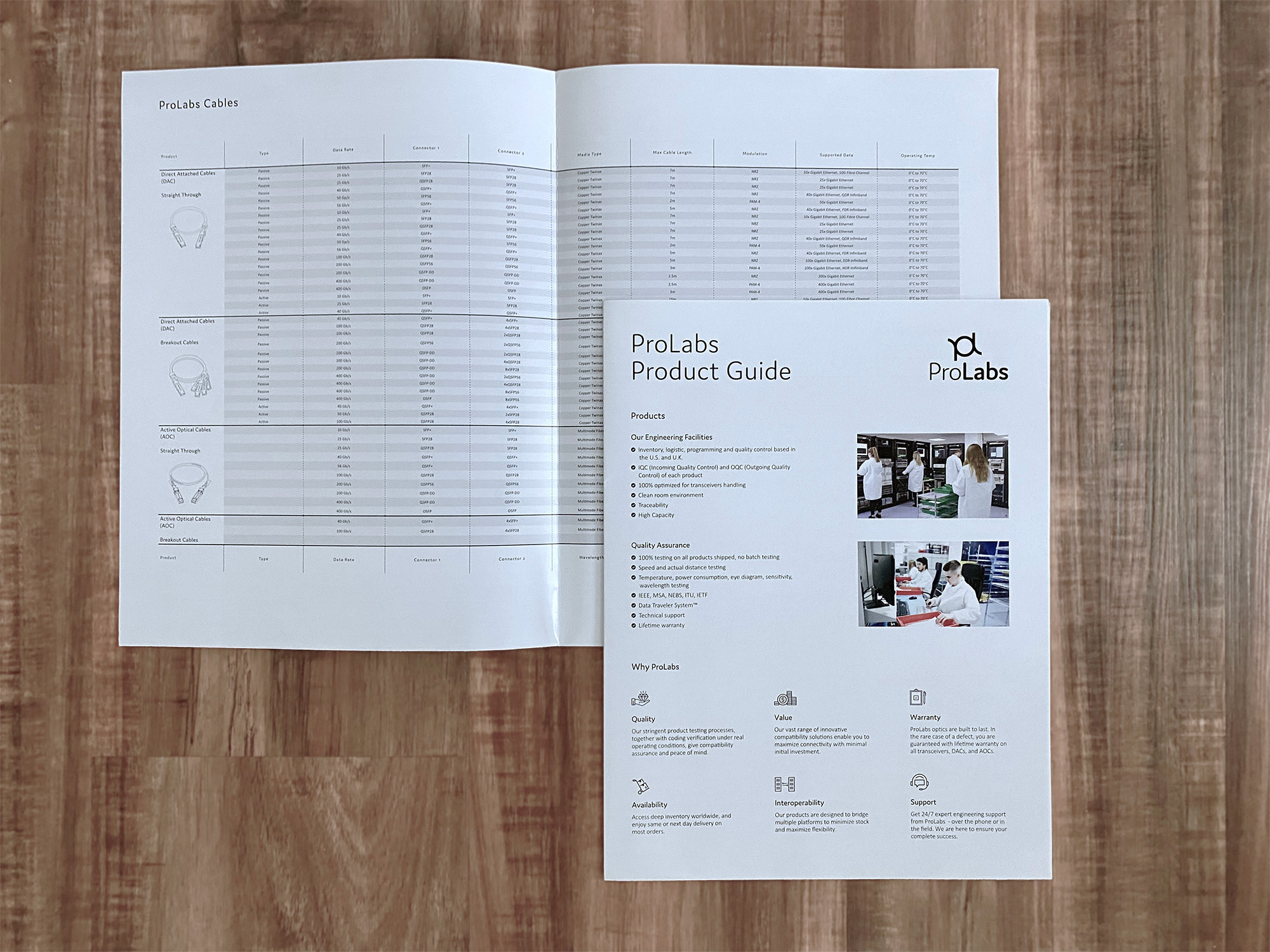
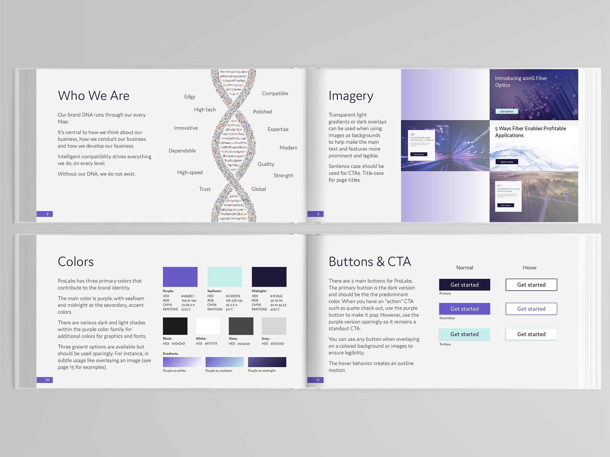
Being a subsidiary of Halo Technology, and having other brands selling the same product, ProLabs needed to have a very distinct look and feel, as well as showcase itself as a global technology leader. As the Senior Designer, I led this project and worked through every stage from UX research and ideation, to design and development. I completely refreshed the brand's visual identity, updated the colors and logo, and researched extensively its needs and those of its users.
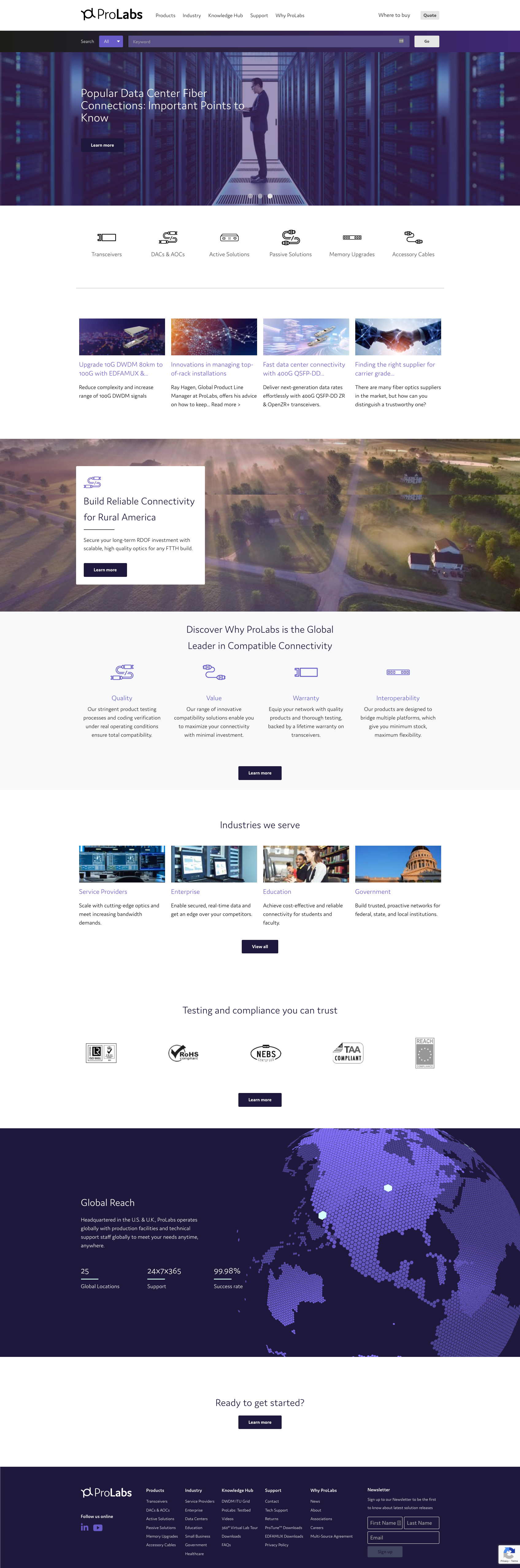
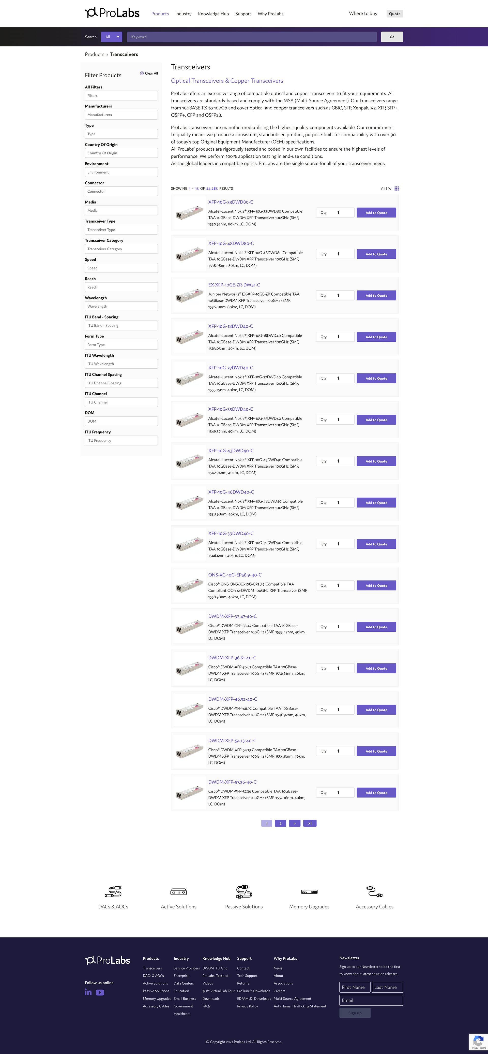
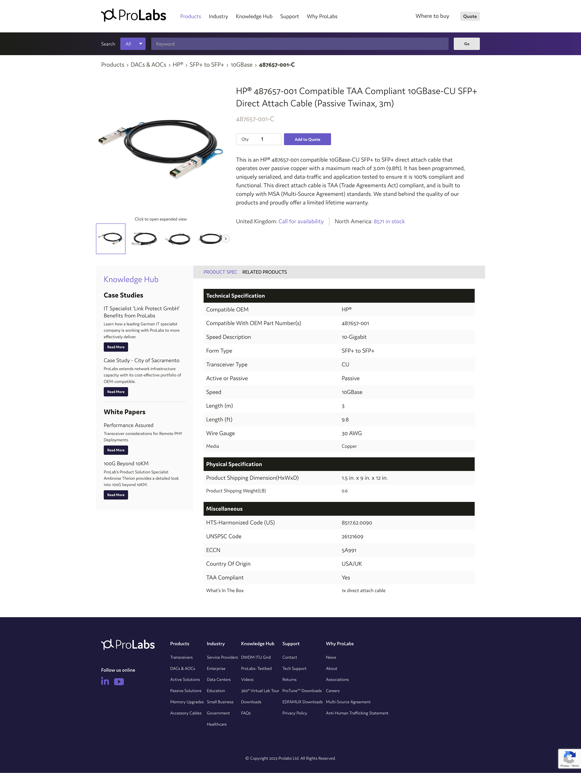
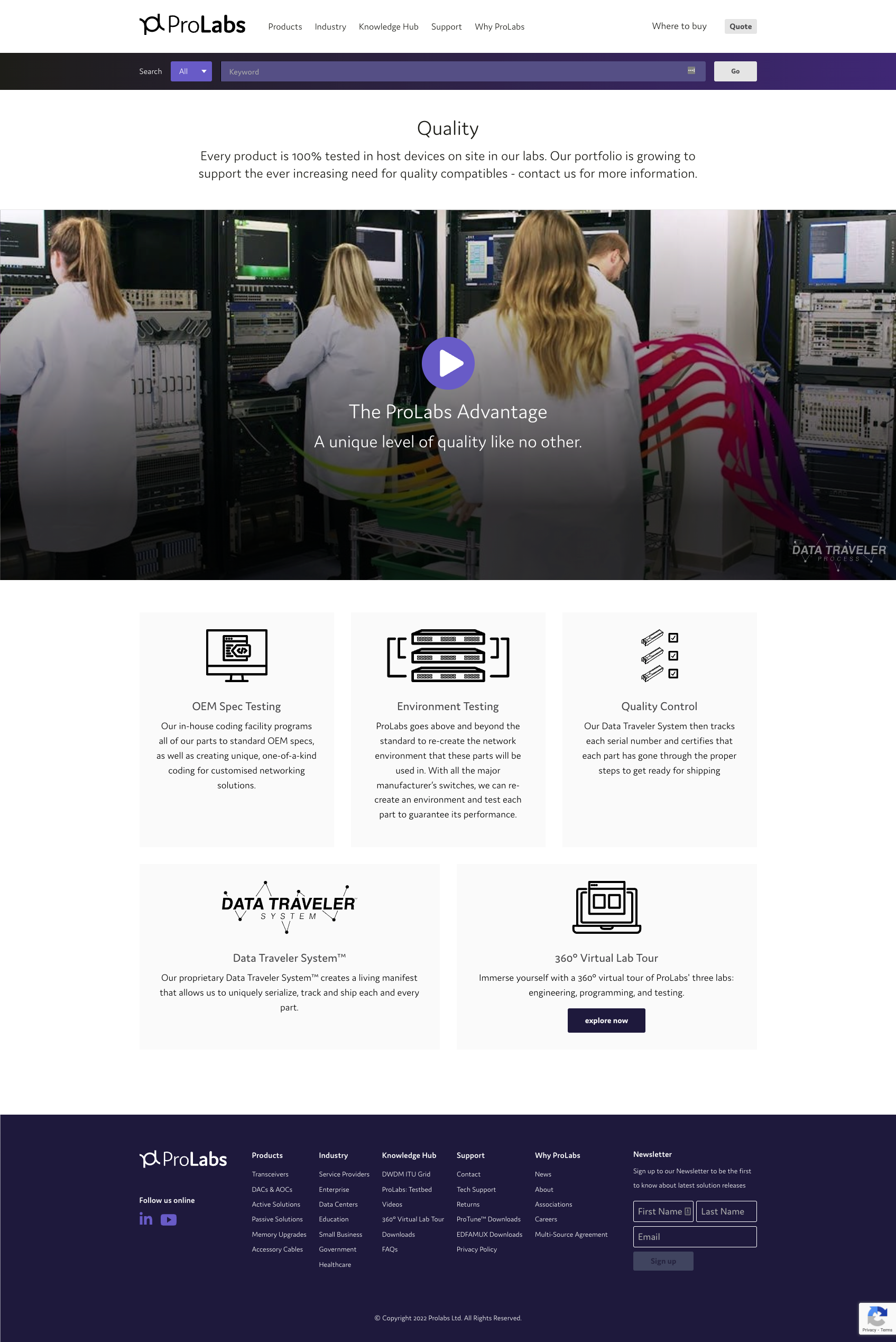
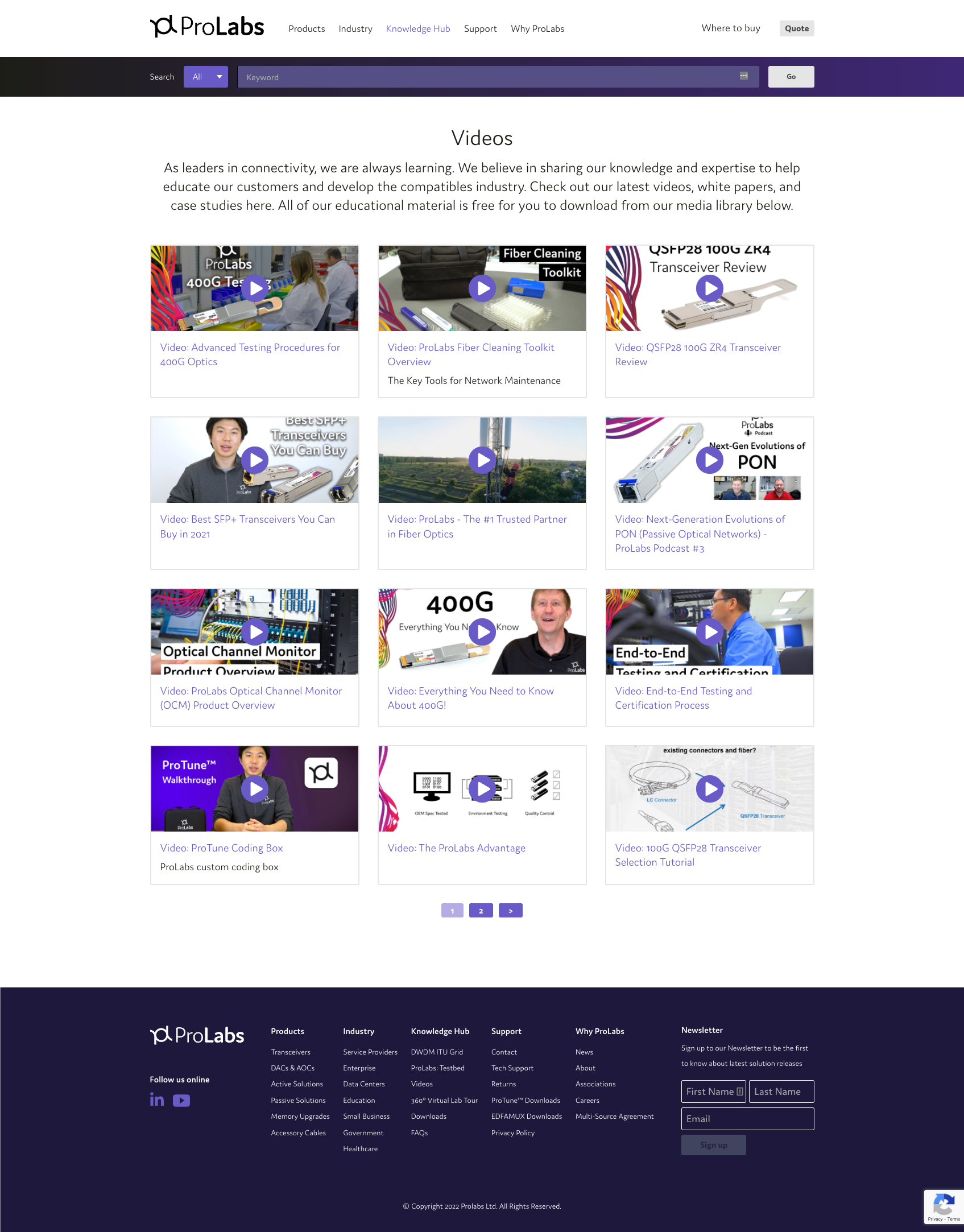
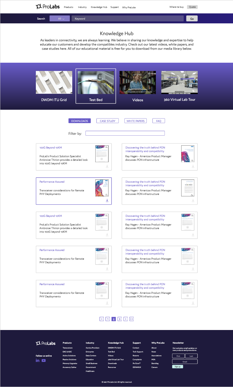
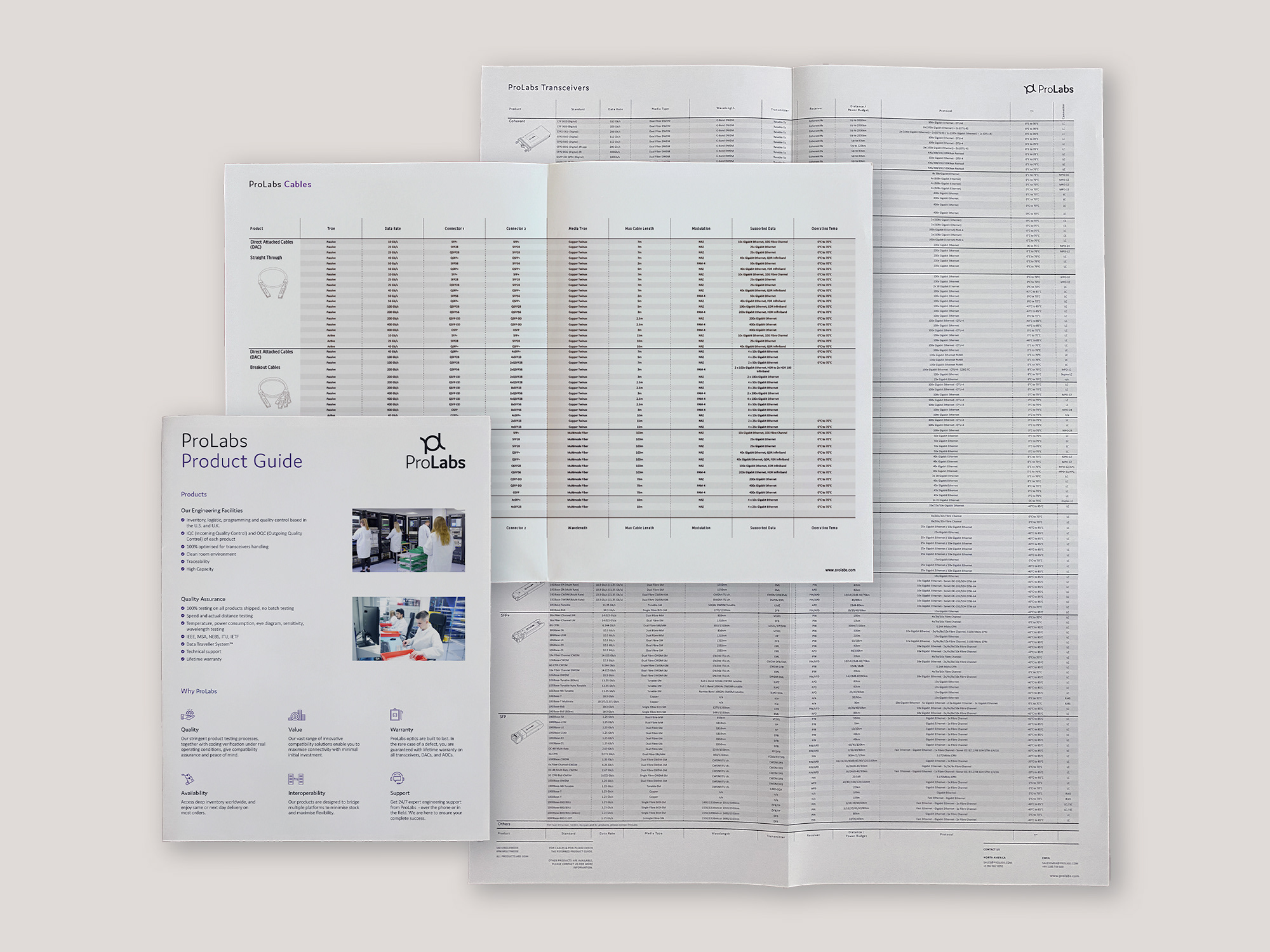
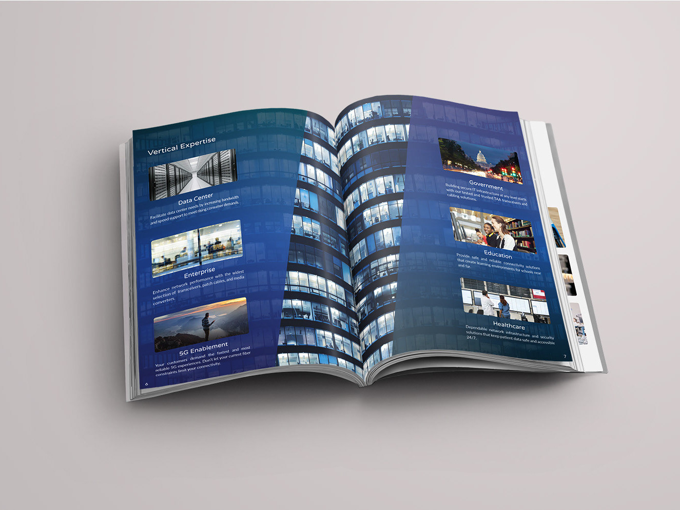
Designed a new homepage, updated pages, created a new navigation menu and search bar, with extensive product filtration that had better UX consideration, and created a new checkout capability for its products. This also involved creating an entirely new design system, filled with web assets, banners, icons, infographics, etc. for other team members to utilize.
Designed a new homepage, updated pages, created a new navigation menu and search bar, with extensive product filtration that had better UX consideration, and created a new checkout capability for its products. This also involved creating an entirely new design system, filled with web assets, banners, icons, infographics, etc. for other team members to utilize.
3. The results:
The new branding significantly advanced ProLabs to visually separate itself from its competitors and properly showcase it as a tech leader. Website traffic increased by 150% within the first 6 months. Web conversion rate optimization (CRO) grew by 165% year-over-year.